Elevator_Homework
For my homework I decided to use the elevator in the Student Union Building next to Barnes and Noble.
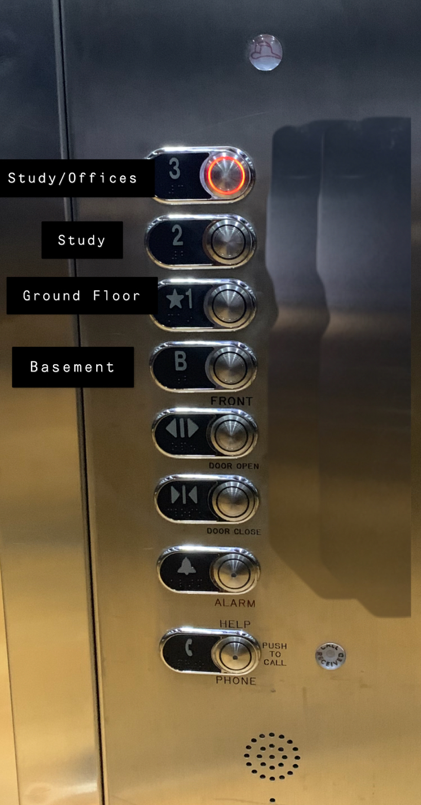
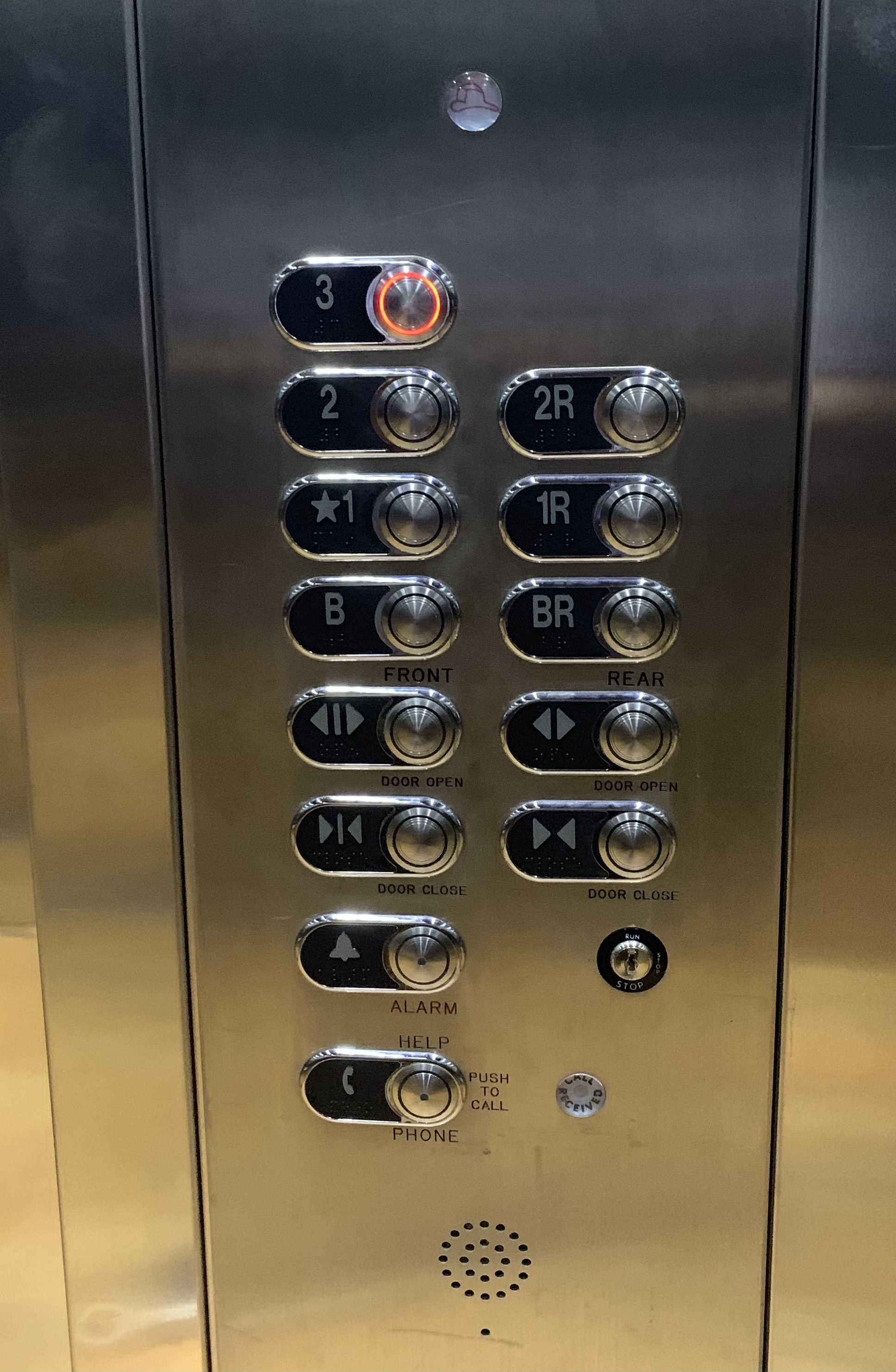
With this elevator one of the issues I noticed was why were there two different rows with the same number except one had an extra R next to it. You can see that one says front and the other says rear, but what does that mean? Once you figure it out how do you know if the side you are looking at is the front or the rear? Another issue is that the one without the R has a star next to it and we can assume that it is the ground floor but couldn’t the button with the B be the ground floor and what floor does B take you to? Last thing I noticed is that for each floor it does not have some type of directory, so how would someone who does not go to this school know exactly what is on the floor.
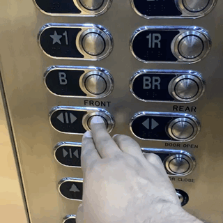
One of the more common uses for elevators is to get you up and down different floors but what else can they be used for? In some of my previous jobs the elevators were used to transport heavy fixtures or different variety of things up and down floors. With this interface it wouldn’t be that hard to transport people or things up and down the elevator but you would just have to understand which side you’re on and which side you are going. So basic flow of events for how the user would use the elevator is they would come in choose their floor (but be positive on where they are going) and then get off on said floor. The tiny issue with the sequence of events is that if they do choose the wrong floor and get off, would they have to go back in and press the other side so it could open or could they just walk around to the original side they wanted to.
For this elevator it is not to hard to try and figure out how to use but the only issue is to figure out which side you are on. Once the user figures out how to use it they can push the button and the button will light up red to let them know which floor they are going to, which is a great design feature because it gives the user feedback and hopefully some ease of mind knowing that they are going to the correct floor.
So for this elevator interface my suggestions would be to just eliminate the whole front and rear thing and just go with one side. I would also try and put some type of small directory on the side to let the user know what is on the floor because if this design was somewhere besides campus like a store or hospital, how would the user know what exactly is on that floor. Some buildings on campus have a small description on what is on said floor next to their number which can be helpful to some users. The things I would keep that the interface currently has is the light showing up when you choose a floor and the braille for the visually impaired. This can be helpful to many different users because everyone has different needs that should be met so they could feel confident with the interface. Below is a little mockup of how the interface would look.